Lesson 1.6 Dashboards
Dashboards
Dashboards are the first thing you see when you log in to the platform under the navigation bar menu "Dashboards". They are highly customizable, easy to edit, and update in real time. Dashboards help you quickly summarize the information you’re interested in—presented clearly and visually engaging.
In this lesson, we’ll go through the following topics:
- Explain when to use Views and when to use Dashboards
- Create a dashboard using some of the available widgets
- Use the floor plan widget to do nice visualizations
- Share a dashboard with other users
When to Use Views vs. Widget-Based Dashboards
Views—in the Device list and Map—are powerful and flexible tools for many use cases.
They are especially effective for:
- Monitoring large sets of devices
- Filtering data using FIWARE Q Queries, including deviation-based conditions
- Exploring data by drilling down into specific devices or conditions
Views are ideal when you want to analyze everything and then zoom in on what’s interesting.
Widget-based dashboards, on the other hand, provide benefits that views can't:
- Full control over layout, positioning, and design
- Ability to highlight specific KPIs and summarize data across systems
- Combine different types of widgets (charts, maps, floor plans, text, etc.) into one unified view
These dashboards are especially useful when:
- You need to present executive-level summaries or real-time KPIs
- Visual clarity and custom arrangement of data is important
- You want to mix multiple data sources or visual styles in the same view
- You're setting up screens for monitoring in control rooms or public areas
- You want to show a limited subset of devices or values with contextual overlays (e.g., on a floor plan)
In short:
Use views when you're exploring or working with large datasets.
Use dashboards when you're presenting, summarizing, or monitoring key metrics in a tailored layout.
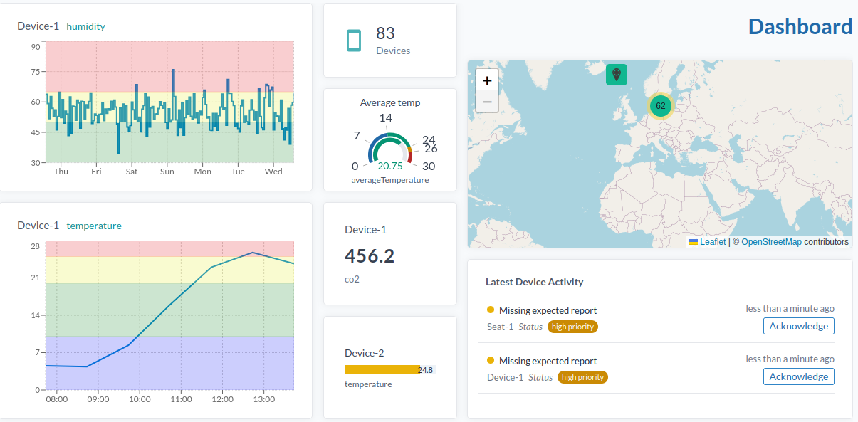
Graph Dashboard
Here’s how to create a graph dashboard:
-
Go to the "Dashboard" menu, click the cogwheel in the top right corner just next to a drop down menu.
-
Select New Dashboard.
-
Name it.
-
Click the cogwheel again and choose Add widget.
-
Select the Device Chart widget.
-
Configure the widget parameters:
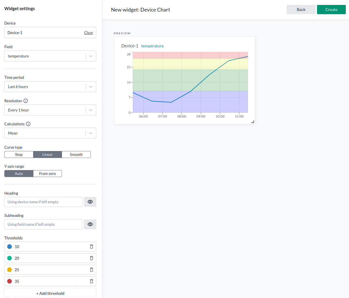
| Parameter | Description |
|---|---|
| Device | The device containing the data you want to display. |
| Field | The specific data field you want to use. |
| Time period | How far back the data should stretch in time. |
| Resolution | The interval between data points (show every point or aggregated). |
| Calculation | Method for aggregating data points (e.g., mean). Disabled if set to "full". |
| Curve type | Display style: step, linear, or smooth curve. |
| Y-axis range | "Auto" for dynamic scale or "From zero" to start at zero. |
| Heading | Chart title; defaults to device name if left blank. |
| Subheading | Subtitle; defaults to data field name if left blank. |
| Thresholds | Color coding for value ranges (e.g., mark values up to a limit with specific colors). |
For more about calculation types, see Calculation Types.
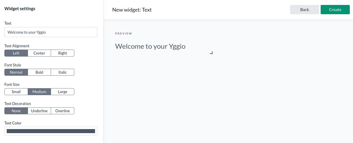
- Go to Add widget menu and add a Text widget. Configure it to your liking. For colors, you can use the platform’s built-in options or specify any hex color code you like (e.g., #FF5733).
- Add a Device Value widget through the Add widget menu. As the name suggests, it shows the current value of the device.
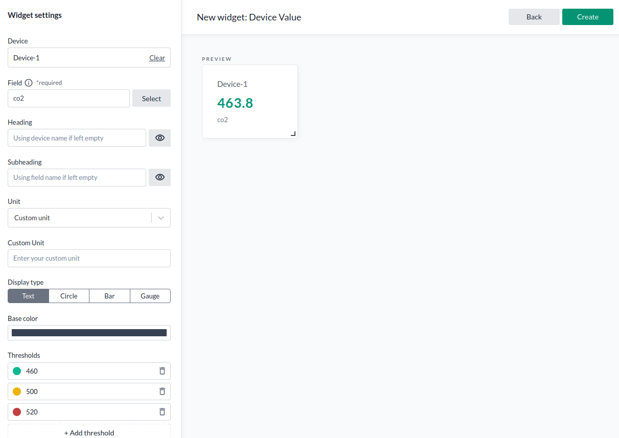
Here’s an example configuration for a gauge widget:
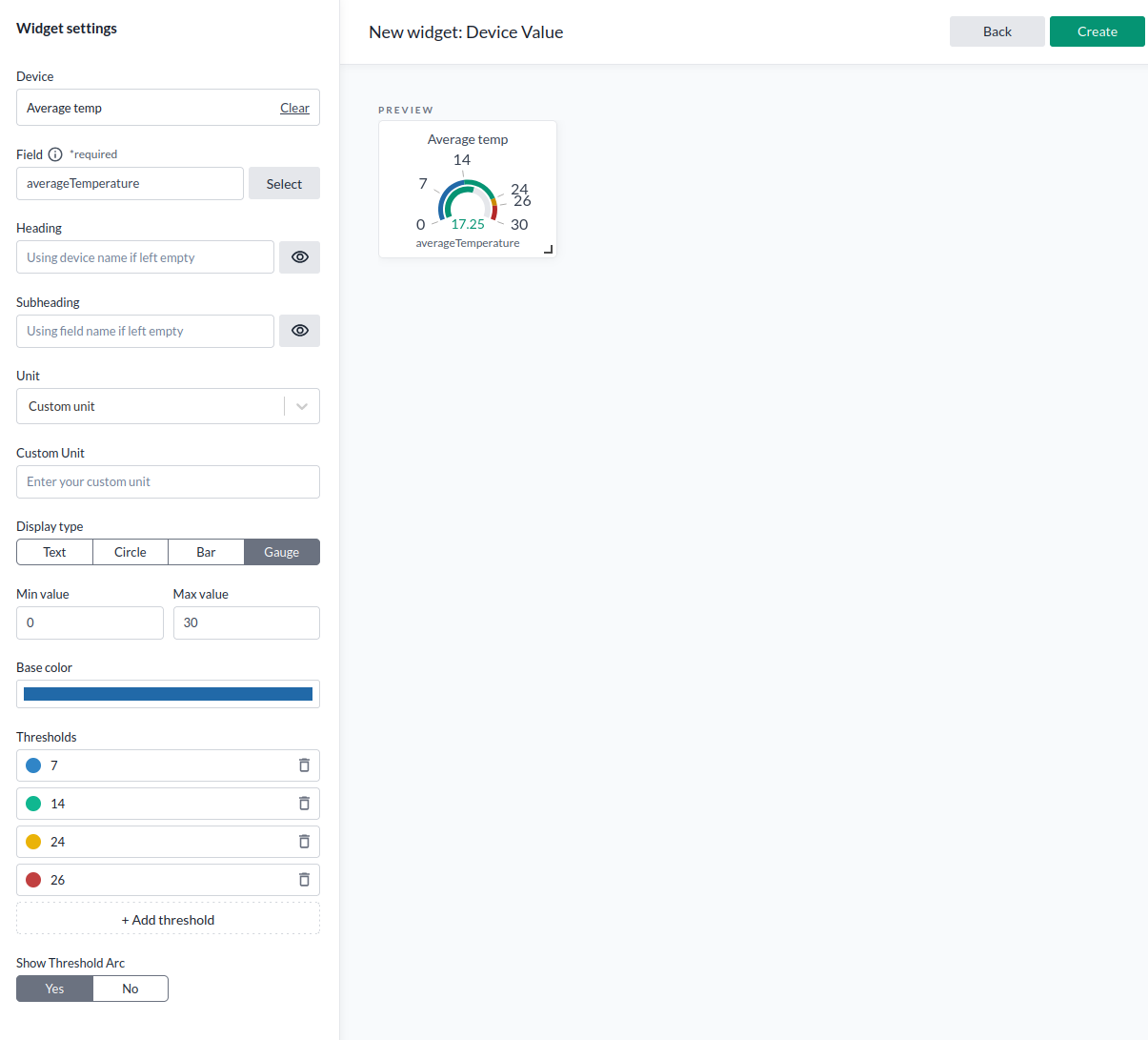
| Parameter | Description |
|---|---|
| Device | The IoT node to pull data from. |
| Field | The specific data field you want to use. |
| Heading | Widget title; uses device name if empty. |
| Subheading | Subtitle; uses field name if empty. |
| Unit | Unit to display; can be custom or predefined. If custom, define or leave empty. |
| Display type | Gauge, text, or bar. |
| Base color | Color for the value when no thresholds are active. |
| Thresholds | Color coding based on the current value. |
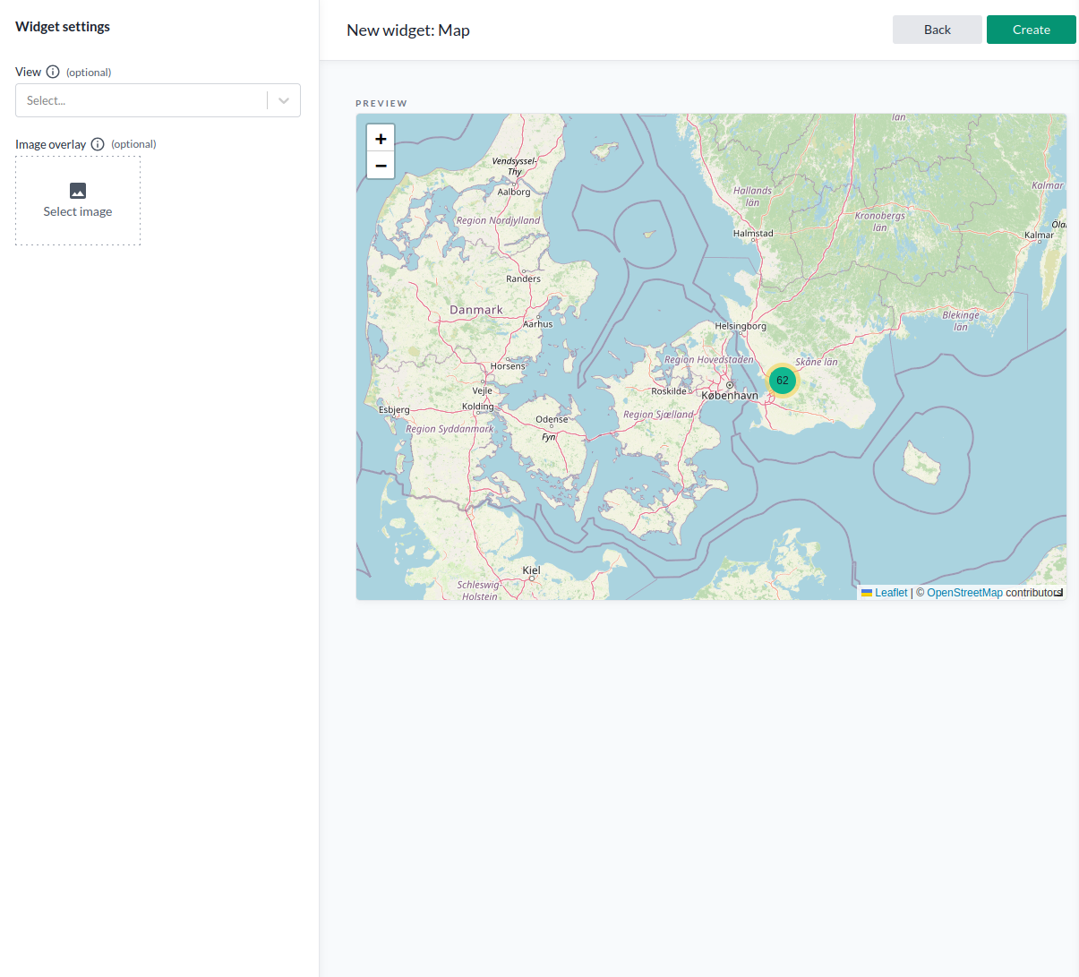
- Add a Map widget to display device locations and data based on existing map views. To use this widget, you first need to create map views that define:
- Which devices to show
- What data to display
- How to visualize the data
The Map widget supports both:
- Outdoor tracking using the standard map
- Indoor tracking by uploading a geocoded floor plan. Assets within the boundaries of the floor plan will get visualized.
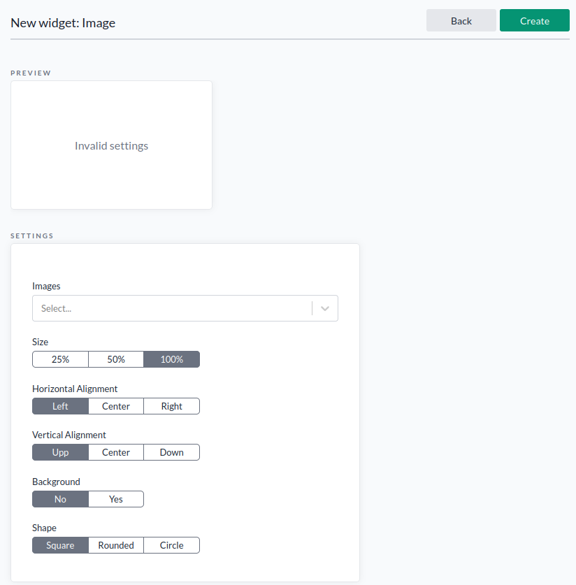
- Add an Image widget via the widget menu.
The Image widget displays a static image on the dashboard.
It's useful for adding logos or graphics to make the dashboard more visually appealing.
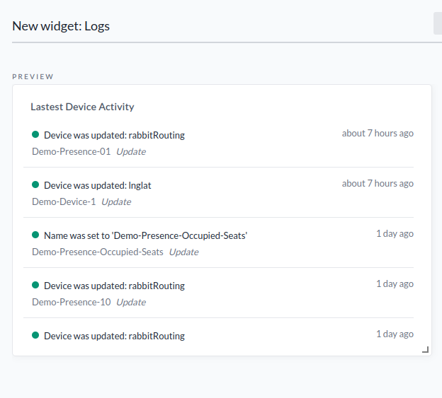
- Add a Log widget to show your latest activity.
-
Add a Resource Count widget. This shows counts of Devices, Rules, Organizations, or Apps and acts as shortcuts.
-
Now that you have several widgets, its time to design the layout of the dashboard. To fix this, use the cogwheel in the top right corner and click Edit widgets. This lets you drag, drop, and resize widgets to organize your dashboard as you like.
- To change the dashboard name or access rights, click the cogwheel in the top right corner and select Manage dashboard. Change the name if needed, then press Save → Done.
Congrats, you’ve created a dashboard!
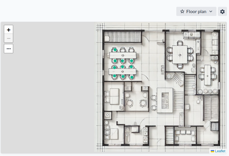
Floor Plan Widget
The Floor Plan widget displays a static image with overlay icons and color-coded indicators. It's ideal for visualizing real-time data in context, such as:
- Office layouts – showing seat occupancy
- Public transport – visualizing seat usage
- Building HVAC systems – indicating valve positions, actuator status, temperatures, pressures, and more
Use this widget whenever you need to present color-coded values or status icons directly on top of an image.
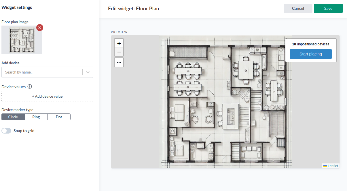
-
Create a new dashboard and add a Floor Plan widget.
-
Add a background image for your floor plan.
You can either select an existing image or upload a new one. -
Add your devices:
You can add them manually one by one, but there's a quicker method if you're adding many:- First, save the widget after adding the image.
- Go to Devices in the navigation bar.
- Use Select many to choose the devices you want.
- Click Add to a Floor Plan widget.
- Select the dashboard you created in step 1.
- Choose the correct Floor Plan widget by its ID (yes, we know this needs an improvement ).
-
To edit or open the widget later, use the widget menu in the dashboard.
-
Press Start placing to position the selected devices on the floor plan, then save your changes.
-
If you’re unhappy with device placement, you can drag and drop devices while editing. Use Snap to grid to align everything perfectly.
Sharing dashboards
Automatic Access Based on Organization
Dashboards are considered resources. If you're a member of an organization where resources are shared, other members with read access at your level in the hierarchy—or higher—will automatically gain access to your dashboards.
Manually Sharing a Dashboard
You can also manually share a dashboard with a specific user or user group:
- Select your dashboard from the Dashboard drop-down menu.
- Click Manage.
- Under Access Rights, enter the account name of the user you want to share with and assign the appropriate access level.
- To share with a user group, use the API (Swagger)—this is currently not possible through the UI.
Important: Sharing a dashboard does not automatically give access to the related IoT nodes.
To allow full visibility of data, you must also share the relevant IoT nodes separately via the Device list.
Q&A
- Question
- Answer
Why use dashboards, isnt device views and map views enough?
Views are ideal for working with large datasets and drilling down into specific details. Dashboards are better suited for summarizing key metrics in a customized layout, making it easier to quickly grasp the overall status. A good approach is to start with views to explore and filter your data—then use dashboards to highlight and present the most important insights.