Grafana
The platform has API-support for two Grafana Data Sources:
- The JSON data source. This enables API-users to host their own Grafana and view time-series data from the platform.
- The Infinity Data Source. This enables Grafana to use all Yggio Rest API and visualize data and also use the Grafana Alert Manager for rules.
If you do not have access to Grafana from your platform account ask a admin to give you access or contact your technical support.
How to make a graph and a map with the JSON data source
Time series
- Choose "Time Series" as the visualization tool on the top right corner.
- Choose the metric(Iotnode) you want visualize in a graph.
- If you choose the wildcard option of your metrics (*), you will get data values from all your active Iotnodes.
How to hide "lat" and "lng" from graph.
- If your node contains data variable "latlng" it will show up on the Time series graph. See below how to hide the coordinates on the graph.
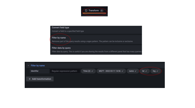
- Make sure you have chosen a metric first and foremost. (Iotnode)
- Click the "Transform" button.
- Choose "Filter by name" option from the Transform dropdown menu.
- Uncheck "lat" and "lng".
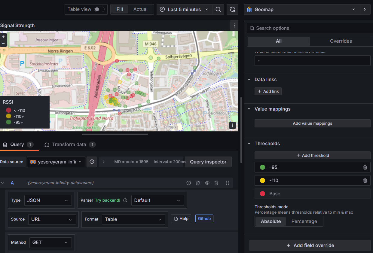
How to use map
- Choose "Geomap" as the visualization tool on the top right corner.
- Choose the metric(Iotnode) you want to visualize on the map
- Make sure you have "lat" and "lng" checked as in previous example.
- If you choose the wildcard option of your metrics (*), you will get GPS-positions from all your active Iotnodes after selecting the "merge" option in "Transform".
How to use map to visulize location history of a Tracker
- Choose "Geomap" as the visualization tool on the top right corner.
- Choose the metric
Your Tracker.lnglatyou want to visualize on the map. This will automatically show a track on the map. - Add another query,
Your Tracker.speedif you want to color code the position in some way. - In the side panel
Markerselect your value to base color coding on and add the thresholds.
![]()
![]()
How to make a tables, graph and maps with the Infinity data source
The infinity Data Source uses the platform Rest API. The easiest way to to understand how to use is to copy complete URLs from the platform <Swagger> (e.g. https://staging.yggio.net/swagger) and use as URL in the different panels. Then add columns with field name from the returned JSONs (check in the response while using Swagger) and then specify the data model. Once configured push the refresh button to try it out.
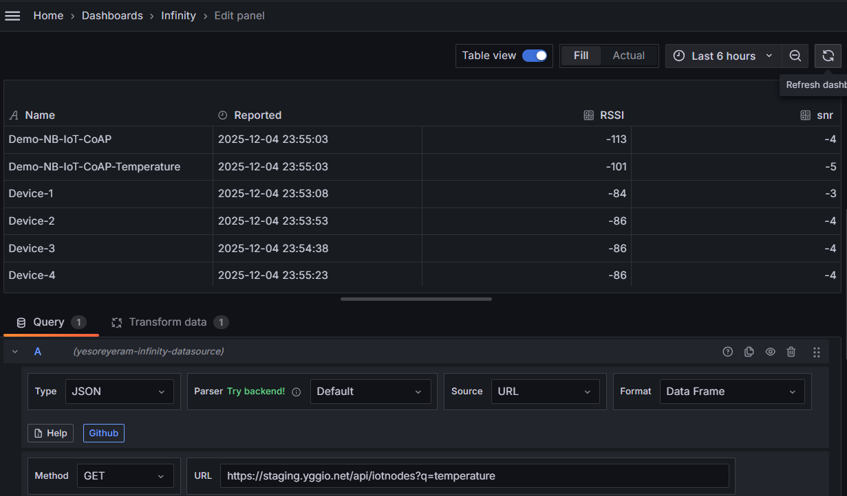
Table
- Choose "Table" as the visualization tool on the top right corner.
- Enter the
GETURLhttps://staging.yggio.net/api/iotnodes, alternatively if you want to filter the devices add a Q query likehttps://staging.yggio.net/api/iotnodes?q=temperatureto only get devices that has the fieldtemperature. - Find the
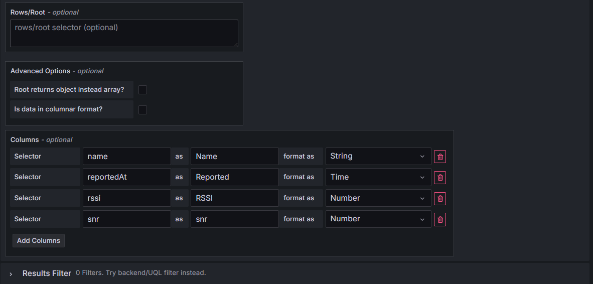
Parsing options & Result fieldsconfig options. Enter the columns you like to have in your table. Example:
- name as Name with data type
String - reportedAt as Reported with data type
Time - rssi as RSSI with data type
Number - snr as SNR with data type
Number
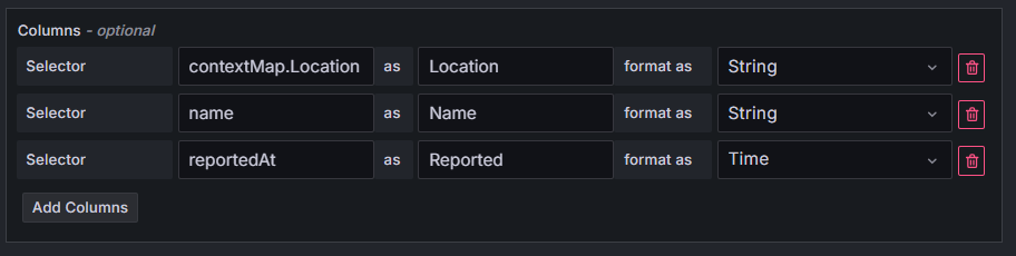
If you instead would like to include contextual parameters just change the selector columns to include contextMap.your fieldname
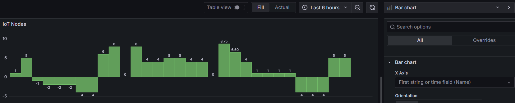
If you instead would like to view the data as a Bar Chart just change the panel type to Bar Chart
Time Series
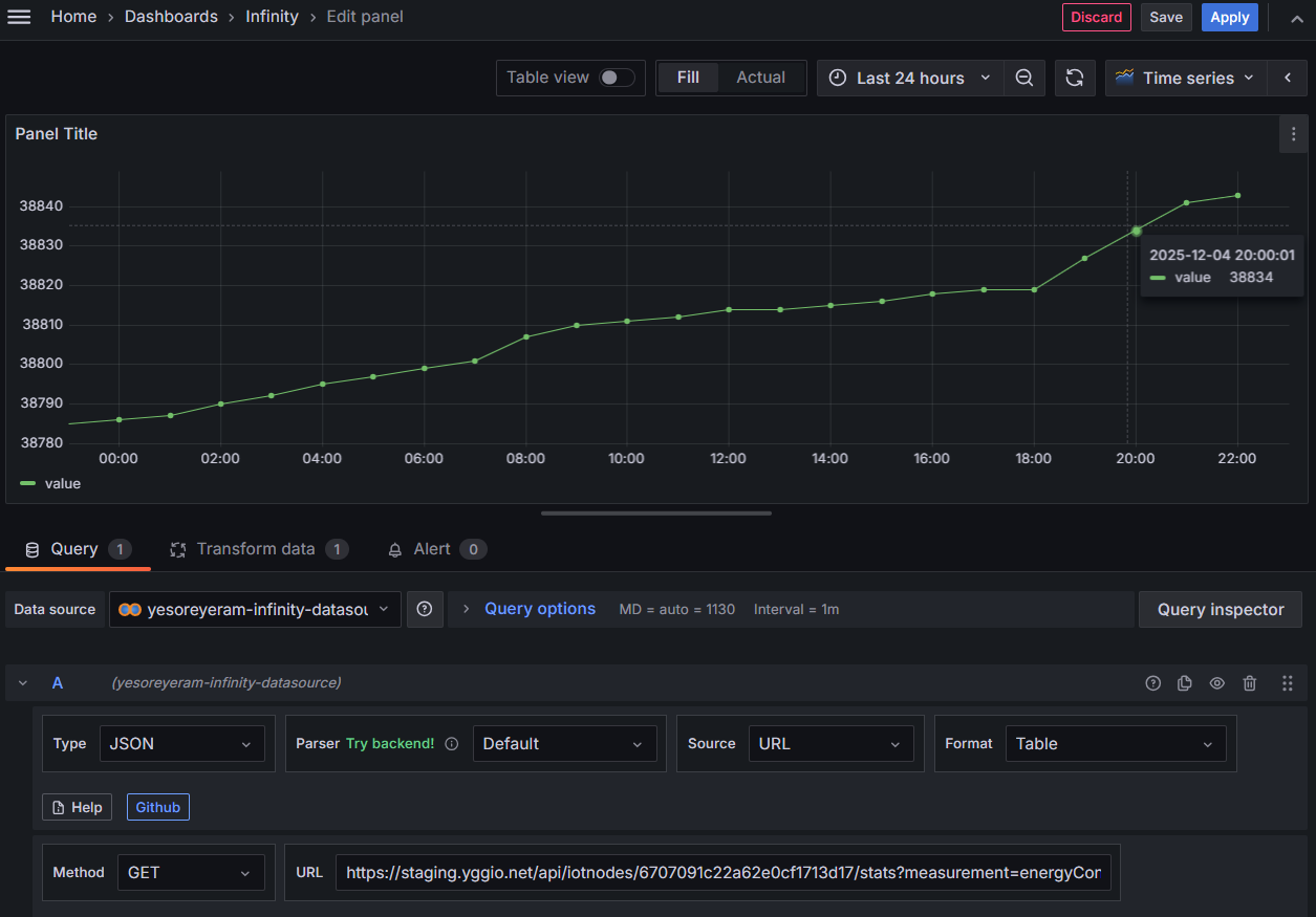
- Choose "Time Series" as the visualization tool on the top right corner.
- Enter the
GETURLhttps://staging.yggio.net/api/iotnodes/<_id of device>/stats?measurement=temperature&start=<start time in unix ms>&distance=3600to get time series of thetemperature. - Find the
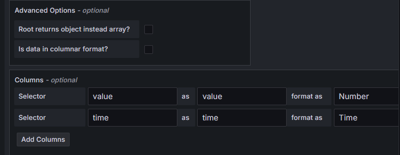
Parsing options & Result fieldsconfig options. Enter the columns to map the time series data:
- value as value with data type
Number - time as time with data type
Time
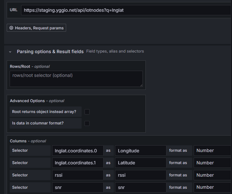
Map
- Choose "Geomap" as the visualization tool on the top right corner.
- Enter the
GETURLhttps://staging.yggio.net/api/iotnodes?q=lnglatto get devices that has a valid location. - Find the
Parsing options & Result fieldsconfig options. Enter the columns to map the location and the values you would like to visulize on the map, example for signa strength map:
- lnglat.coordinates.0 as Longitude with data type
Number - lnglat.coordinates.1 as Latitude with data type
Number - rssi as RSSI with data type
Number - snr as SNR with data type
Number
- Add thresholds for different color coding on the map