Floor Plan
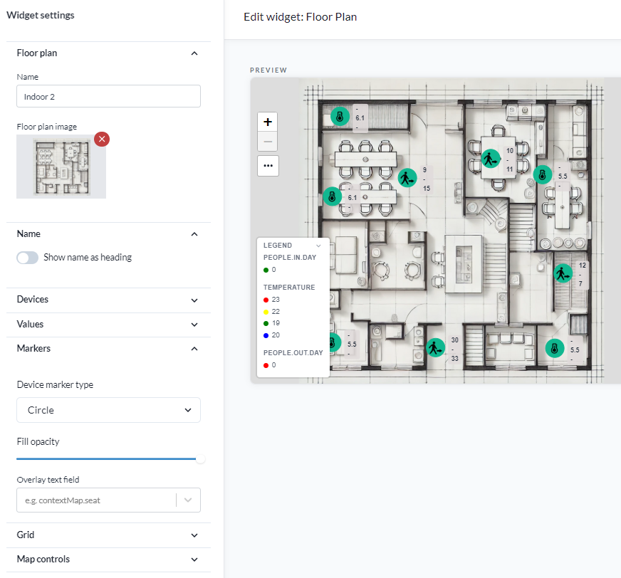
The Floor Plan widget displays device markers and their values on a background image. The image is usually a building floor plan, but it can be any layout the devices sit in - a train carriage or bus seating plan, a rack elevation, a site drawing.
Placement here is free. You drag each marker to where it belongs on the image, and that has nothing to do with the device's position. A device with no coordinates at all can be placed on a floor plan, and moving it here does not change its coordinates. That is what lets the widget work for things with no fixed geography, such as a vehicle.
If you want devices to appear at their true geographic positions instead, use the Map widget with the floor plan as a geo-referenced overlay image. The two widgets answer different questions: this one is "where in this space", the map widget is "where on earth".
Widget settings
The settings panel is grouped into sections, in the order below.
Floor plan
Floor plan image sets the background image. Images are uploaded by drag and drop.
Note: removing the image resets the position of every device on the widget. The dialog says so before it happens.
Name
- Name sets the widget name.
- Show name as heading prints each device's name by its marker.
- Name style is Text only or Box.
- Name position places the name relative to the marker: top, middle or bottom, each left, centre or right.
- Text size and Text color set the type.
- Name background and Opacity apply to the Box style, and can be set to Transparent.
Nine name positions exist because markers crowd. On a dense plan, moving the name to a different corner per marker is what keeps the labels apart.
Devices
Add device adds devices one at a time. To add many at once, use Select many from the device list with the action "Add to floorplan widget". The floor plan has to exist first. Either way the devices arrive unplaced, and you drag each to where it belongs.
Device values underneath decides which readings the markers carry, and what colour they are. It has its own section below: Device values.
Values
- Show value shows or hides the device values on the markers.
- Show value background draws a panel behind them, so they stay readable over a busy drawing.
- Opacity sets how solid that panel is.
Markers
- Device marker type is circle, ring, dot, square or seat.
- Fill opacity sets how solid the marker is, so markers do not hide the drawing underneath.
- Overlay text field prints any field path on the marker itself, for example
contextMap.seat. It labels a marker with something the device carries rather than with its reading - a seat number, a desk ID, an asset tag.
The seat marker is for seat occupancy, where the drawing is a seating plan and each marker stands for one place. It covers desks in an office as well as seating in public transport, where the background image is a carriage or bus layout rather than a building.
Grid
- Snap to grid makes markers snap to a grid as you drag them.
- Grid cell size sets the spacing.
- Grid offset X and Grid offset Y shift the grid, so it can be lined up with the drawing rather than with the widget's corner.
The grid is what makes a row of seats or a rack of meters line up instead of nearly lining up.
Map controls
Show map controls shows or hides the zoom and pan controls on the widget.
Working on several markers at once
The settings above apply to every marker in the widget. To change some of them, put the plan into Select many mode and work on a selection instead. This is not a section of the settings panel - it is a mode the plan itself goes into.
- Open the widget's settings, if they are not already open. The mode only exists while they are.
- On the plan, open the "..." menu and choose Select many. The menu is hidden when Show map controls is off, so turn that on first if you cannot see it.
- The selection bar appears above the plan, empty, telling you to drag a rectangle. Drag to select, hold Shift and drag to add to the selection, or click individual markers.
Note: Select many here is not the Select many in the device list. That one picks devices to add to the widget; this one picks markers already on the plan.
Outside this mode, dragging a marker moves it, which is how markers are placed in the first place.
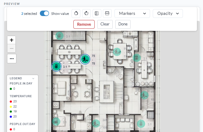
| Action | What it does |
|---|---|
| Rotate left / Rotate right | Turns the selected markers |
| Mirror horizontally / Mirror vertically | Flips them |
| Markers | Changes the shape of the selected markers |
| Opacity | Sets how solid the selected markers are |
| Show value | Shows or hides the reading on the selected markers |
| Remove | Takes the selected devices off the plan. It asks for confirmation first |
| Clear | Drops the selection and stays in the mode |
| Done | Leaves the mode, and clears the selection on the way out. Esc does the same |
Mirror and Show value are on only when every marker in the selection is, so a mixed selection reads as off and one click turns the whole selection on.
This is how a row of desks is turned to face the right way, or how one bank of seats is given a different shape from the rest, without opening the settings for each device in turn.
Device values
A device value is one field taken from the devices, printed on their markers and coloured by rules you set. Up to five can be added, from Device values in the Devices section.
Add device value opens the editor:
- Pick the Field. The dropdown lists the fields found on the widget's devices, and you can type
one that is not offered, for example
presenceortemperature. - Optionally enter a Display name. Left empty, the field name is used.
- Choose the Value type: Number, Boolean or Text. Switching type clears the rules already entered, because the three kinds take different rules.
- Add the rules.
- Number: a condition - Greater than or equal, Greater than, Equal, Less than or equal, Less than - then a value and a colour.
- Boolean: true or false, and a colour.
- Text: the exact value, the text to show in its place, and a colour.
- Press Add device value.
The star beside a value in the list promotes it: its colour goes on the marker itself, not only on its own text. One value is starred at a time.
What colour a marker gets
The first of these that applies wins.
- The starred value, if one of its rules matches the device's current reading.
- For LoRaWAN devices, the signal strength colour - the same one behind the network coverage map.
- The device's status: yellow for a warning, red for an error.
- Green.
A starred presence value therefore turns an occupied desk red even on a device whose radio signal
is good, which is the point of starring it.
The legend
A widget with device values gets a Legend panel in its bottom left corner, listing each value and what its colours mean. Click the header to fold it away.
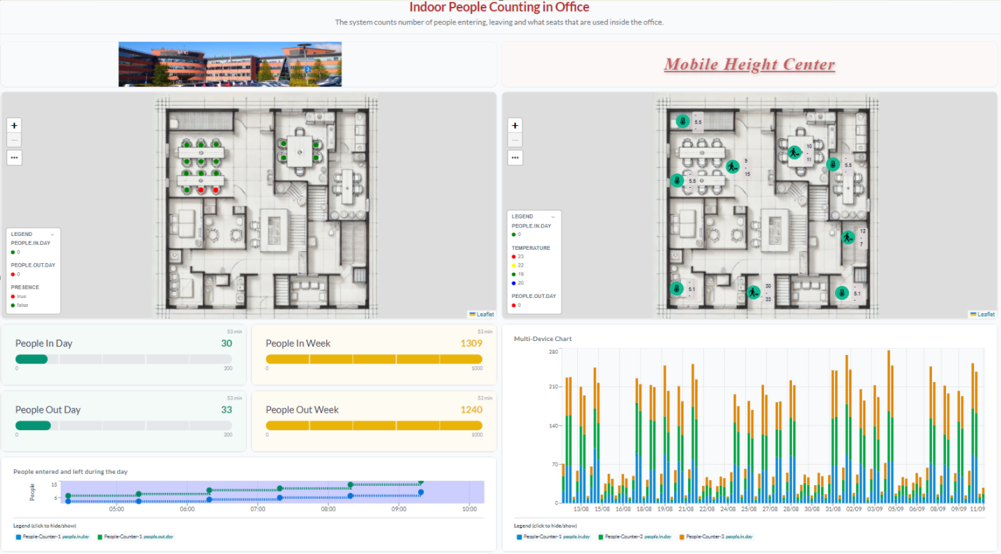
Below, a people counting dashboard built on two floor plans of the same office. On the left, seat
markers coloured by a starred presence value - green for a free desk, red for a taken one. On the
right, the same office with the counts and the temperature printed on the markers, each field in the
legend with its own colours.