Simple widgets
This page covers the dashboard widgets that are configured in one short panel: Image, Logs, Resource count, Navigation, Text and Pie chart. The rest have a page each - see the widgets.
Image
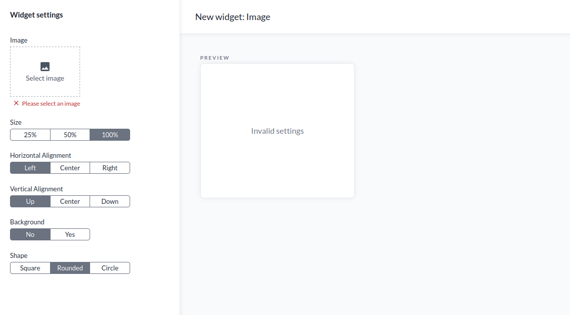
The Image widget displays a selected image within the dashboard. The following settings are available:
- Size sets the image to 25%, 50%, or 100% of the widget area.
- Horizontal Alignment is left, center, or right.
- Vertical Alignment is top, center, or bottom.
- Background enables or disables a background behind the image.
- Shape is square, rounded, or circle.
Logs
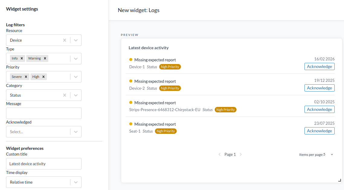
The Logs widget puts a filtered slice of the Logs page on a dashboard. It carries the same filter set, so any view you can pick out there can be left up on a screen - alarms awaiting acknowledgement, or a developer's view of what is crashing.
The Log Filters section limits which entries are shown:
- Resource filters by resource type: Device, Organization, User group, Connector or Rule.
- Type filters by log type. Several at once. Error, Warning and Info are the everyday ones; Debug is where translator crashes land and Verbose carries network server messages.
- Priority filters by priority. Several at once: Severe, High, Medium, Low.
- Category filters by category, for example Status or System.
- Message filters by matching text in the log message.
- Acknowledged filters by whether the entry has been acknowledged.
- Filter by time limits the widget to a period, with the same ready-made periods as the Logs page. Off by default, so the widget shows everything.
The Widget Preferences section provides the following additional options:
- Custom Title sets an alternative heading for the widget.
- Time Display sets the timestamp format to relative time, exact time (24-hour, to the second) or both.
Two worth building:
- An alarm board. Priority Severe and High, Acknowledged set to Unacknowledged.
- A translator watch. Type Debug with Category System, which shows translator failures as they happen. Those entries are only kept for six hours, so a time filter of the last 24 hours costs nothing.
Resource Count
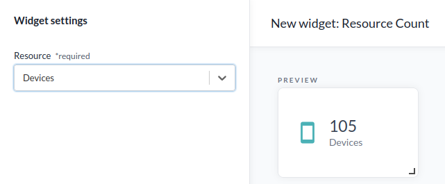
The Resource Count widget displays the number of devices, locations, organizations, apps, or rules. It also works as a shortcut.
Navigation

The Navigation widget is a direct link to another dashboard, with a customizable label, icon, and color.
Setup
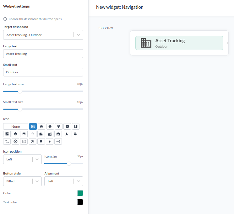
- Target Dashboard sets the dashboard the button links to.
- Large Text sets the primary label shown on the button.
- Small Text sets a secondary line of text shown below the large text.
- Large Text Size sets the font size of the large text.
- Small Text Size sets the font size of the small text.
- Icon selects an icon from the list, or None.
- Icon Position is left or above the text.
- Icon Size sets the icon size.
- Button Style is filled, outline, or plain.
- Alignment is left, center, or right.
- Color sets the button's color.
- Text Color sets the color of the large and small text.
Text
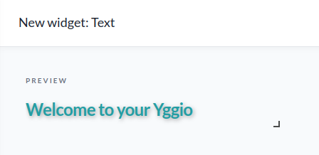
The Text widget displays static text content within the dashboard.
Setup

The text content is entered in the Text field.
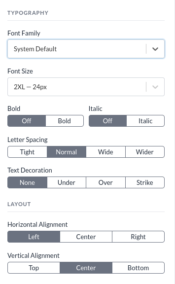
The Typography section provides the following options:
- Font Family is one of: System default, Arial, Times New Roman, Courier New, Lucida Console, or Impact.
- Font Size ranges from 12 px (XS) to 60 px (6XL).
- Bold is either bold or off.
- Italic is either italic or off.
- Letter Spacing is tight, normal, wide, or wider.
- Text Decoration is none, underline, overline, or strikethrough.
The Layout section provides the following options:
- Horizontal Alignment is left, center, or right.
- Vertical Alignment is top, center, or bottom.
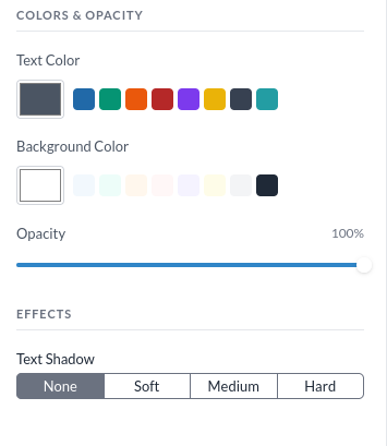
The Colors and Opacity section sets the text color, background color, and opacity. Opacity ranges from 10% to 100%. A color picker opens when selecting any of the color fields.
The Effects section configures a text shadow. Options are none, soft, medium, or hard.
Colour selector
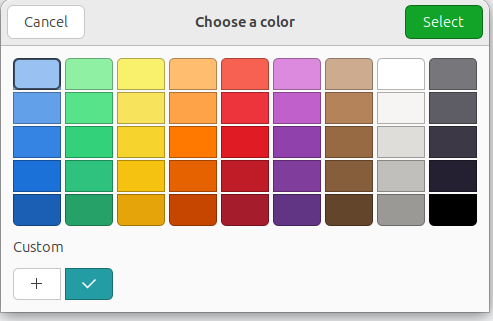
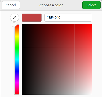
A color is selected from a preset, using the color picker, or by entering a hex code.
Pie Chart
The Pie chart widget compares one field across several devices, drawing each device as a slice of the total. It answers a question of proportion rather than level: which meter accounts for most of the consumption, how a total splits across a site.
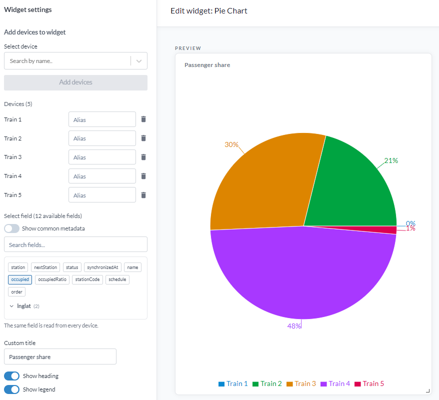
The same field is read from every device, so it only makes sense where the values add up to a meaningful total. Consumption, counts and areas work. Temperatures do not - the sum of four room temperatures is not a quantity. For levels rather than shares, use Multi-device value or Equalizer.
Setup
- Under Devices, select the devices to include. Each becomes one slice.
- Set Field, the field read from every one of them.
- Optionally give a device an Alias, used in the legend in place of the device name.
- Custom title sets a heading for the widget.
- Show heading shows or hides the heading.
- Show legend shows or hides the legend listing the devices and their colours.
A device that is not reporting the field contributes no slice. Values refresh every 30 seconds.