Lesson 3.1 Grafana
Grafana is a popular open-source tool for dashboards, maps and alerts. With the IoT platform's two Grafana data sources you can visualize your devices' live and historical data, build fleet overviews, and get notified when something goes wrong. In this lesson you'll build your first Grafana panels against the IoT platform's data.
For the full reference (every option), see the Grafana user guide.
Before you start
- Grafana must already be installed and connected to the IoT platform. If it isn't, do the one-time setup first: Grafana Setup.
- You need a few active devices in your account on the IoT platform (from the earlier
lessons) - ideally something reporting
temperature, and a tracker withlnglatfor the map exercise.
Exercise 1 - Your first time-series graph
- In Grafana, go to Dashboards → New → New dashboard, then click Add visualization.
- When prompted, pick the JSON data source.
- Top-right, set the visualization type to Time series.
- In the query editor, open the Metric dropdown and select one of your
devices (each device is a metric). Selecting
*graphs all your active devices at once. - Set the dashboard time range (top-right) to e.g. Last 24 hours and click Refresh.
- Click Apply (top-right) to add the panel to the dashboard.
→ The device's values are plotted over time.
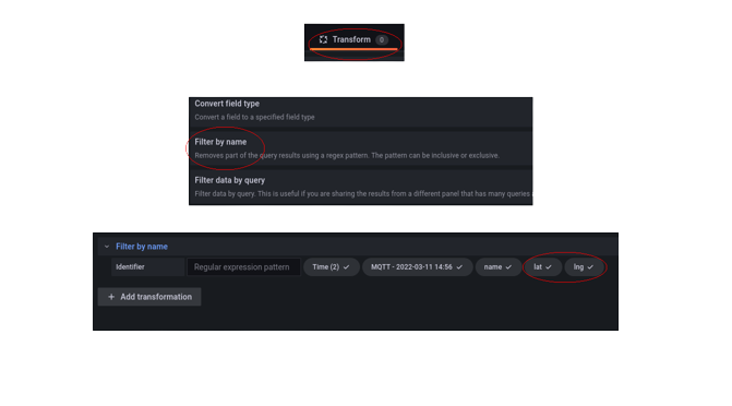
If
lat/lngclutter the graph, open Transform data → + Add transformation → Filter fields by name and unchecklatandlng.
Exercise 2 - Put your devices on a map
- On the dashboard, click Add → Visualization and pick the JSON data source again.
- Set the visualization type to Geomap.
- Select your tracker (or any located device) as the Metric, and make sure
latandlngare included. - For a tracker's route, select the metric
<Your Tracker>.lnglat- the track draws automatically. To colour it, add a second query<Your Tracker>.speedand, in the Map layers → Markers options, colour by that value with thresholds. - Click Apply.
→ Your devices show as points; a tracker shows its path.
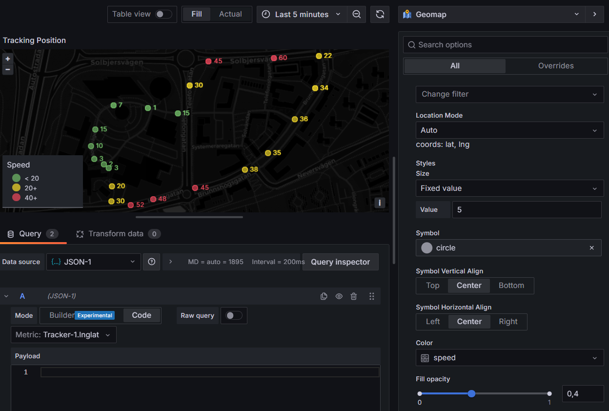
Exercise 3 - A fleet overview table
This uses the Infinity data source, which can call any of the IoT platform's REST endpoints.
- Add → Visualization; this time pick the Infinity data source.
- Set the visualization type to Table.
- In the query, set
Type=JSON,Source=URL,Method=GET, andURL=https://staging.yggio.net/api/iotnodes(add?q=batteryLevelto list only your sensors). - Open Parsing options & Result fields → Columns and add one row each
(Selector → as → Format):
name→ Device → StringbatteryLevel→ Battery % → Numberrssi→ RSSI → Numbersnr→ SNR → NumberreportedAt→ Last reported → Time
- Colour the battery column: Field → Add field override → Fields with name →
Battery %, set Cell display mode = Colored background, then under
Thresholds add red
<20, amber<50, base green. - Click the Last reported column header to sort, so silent devices rise to the top.
- Click Apply.
→ One row per device with battery, signal and last-seen.
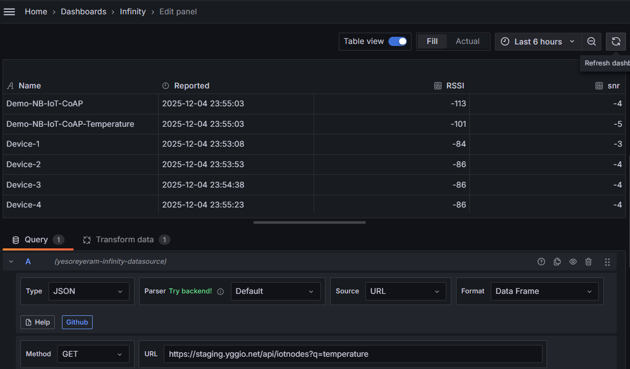
You now have an at-a-glance health view of every device.
Stretch goal - get alerted
Using the Infinity data source you can have Grafana notify you when a value crosses a threshold (e.g. temperature too high) or when a device stops reporting. Follow the step-by-step in the user guide: Set up a simple alert.
What you learned
- The IoT platform's two data sources: JSON (quick device graphs & maps) and Infinity (any REST endpoint → tables, charts, maps, alerting).
- How to build a time-series graph, a Geomap, and a fleet table.
- Where to go for thresholds, transforms and alerting.
Where next
- Grafana user guide - panel-choice table, tips & techniques, and more recipes (energy-per-day, occupancy timelines, alerting).
- Next lesson: Power BI.