Grafana
IoT-plattformen stödjer två Grafana-datakällor:
- JSON-datakällan (simpod-json-datasource) - kör din egen Grafana och visa tidsseriedata från plattformen.
- Infinity-datakällan - använd valfri av IoT-plattformens REST-API-ändpunkter för att bygga tabeller, diagram och kartor, och driva Grafanas Alert Manager.
Den här guiden visar hur du bygger paneler. För att installera och ansluta Grafana först, se Grafana-installation. Om du inte har åtkomst till Grafana från ditt konto på plattformen, be en administratör om åtkomst eller kontakta din tekniska support.
Vilken datakälla ska jag använda?
| Använd… | när du vill… |
|---|---|
| JSON-datakällan | snabbt visa grafer för en enhets värden eller plotta enheter på en karta (enheten vald som ett "mått/metric") |
| Infinity-datakällan | hämta valfritt REST-API-svar till en tabell, bygga diagram/kartor från godtyckliga ändpunkter, eller sätta upp larm |
Fältnamn är IoT-plattformens kanoniska fält (
temperature,rssi,lnglat, …), så en panel byggd för en enhet fungerar för andra enheter av samma typ.
Bygg paneler med JSON-datakällan
Tidsseriegraf
- Välj Time series som visualisering (uppe till höger).
- Välj måttet (IoT-noden/enheten) du vill visa i en graf.
- Att välja jokertecknet (
*) som mått visar värden från alla dina aktiva enheter.
Dölj lat/lng från en graf
Om en enhet har ett lnglat-fält visas dess lat och lng i tidserie-
grafen. För att dölja dem:
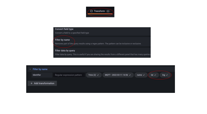
- Se till att ett mått (enhet) är valt.
- Klicka på Transform.
- Välj Filter by name.
- Avmarkera
latochlng.
Karta (Geomap)
- Välj Geomap som visualisering (uppe till höger).
- Välj måttet (enheten) att plotta.
- Se till att
latochlngär markerade (motsatsen till föregående steg). - Att välja jokertecknet (
*) som mått plottar GPS-positionerna för alla dina aktiva enheter - efter att ha valt alternativet Merge under Transform.
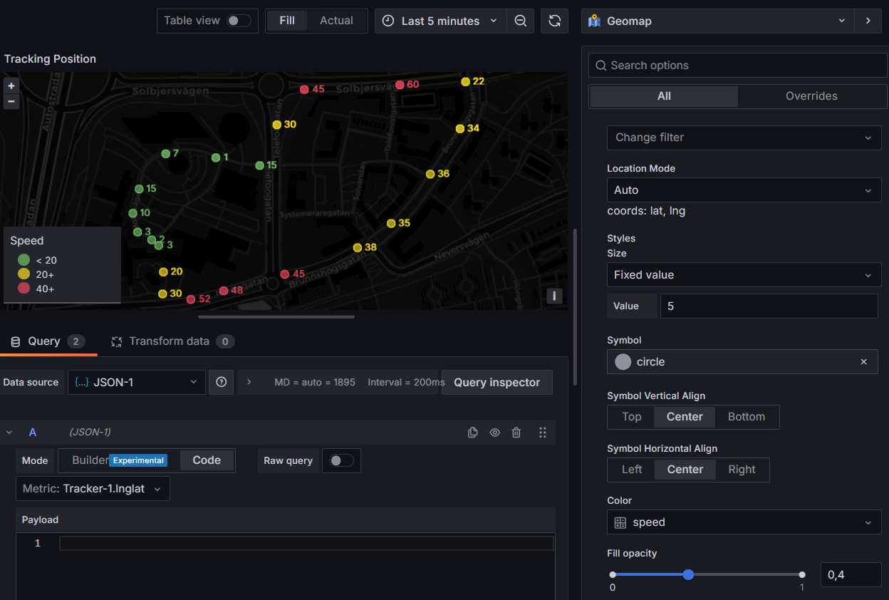
Historik för trackerns position
- Välj Geomap som visualisering (uppe till höger).
- Välj måttet
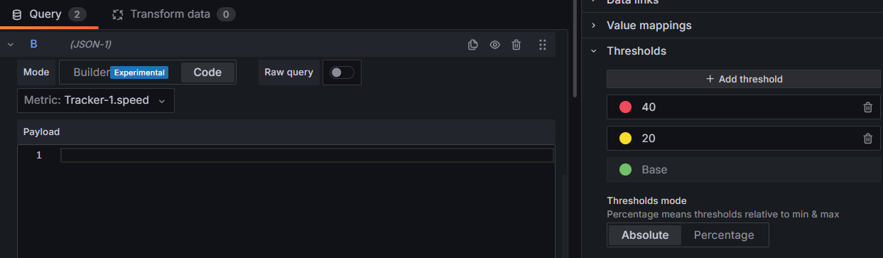
Din Tracker.lnglat- detta ritar spåret på kartan automatiskt. - Lägg valfritt till en andra fråga,
Din Tracker.speed, för att färgkoda spåret. - I sidopanelen Marker, välj värdet att färgkoda efter och ställ in tröskelvärdena.
Bygg paneler med Infinity-datakällan
Infinity-datakällan anropar IoT-plattformens REST-API direkt. Det enklaste sättet att
lära sig den: kopiera en komplett förfråga-URL från Swagger (https://staging.yggio.net/swagger),
klistra in den i panelen, lägg sedan till kolumner med fältnamnen från JSON-
svaret (synligt i Swagger) och ställ in varje kolumns datatyp. Klicka på uppdatera för att
testa.
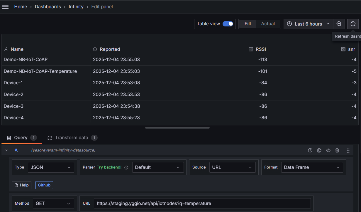
Tabell
- Välj Table som visualisering (uppe till höger).
- Ange
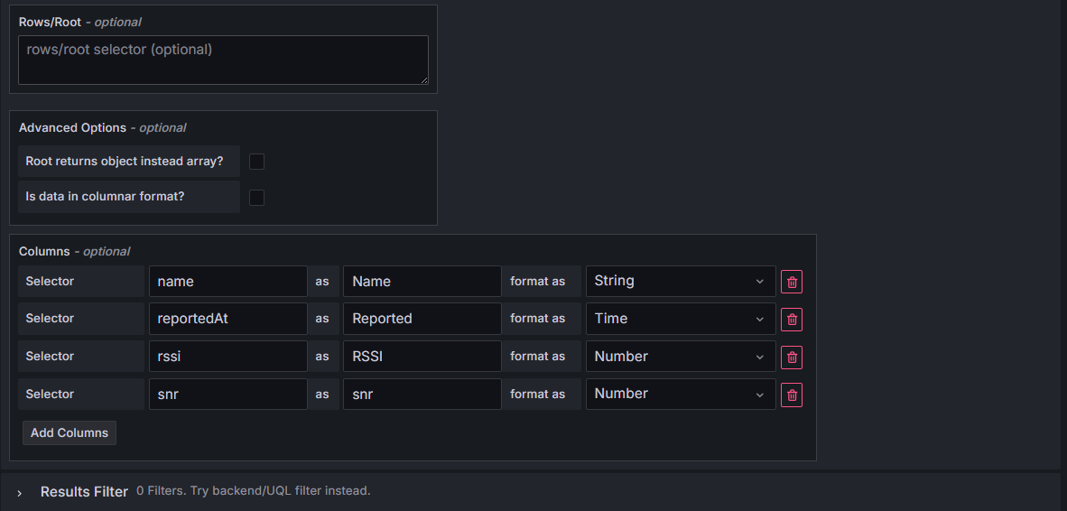
GET-URL:enhttps://staging.yggio.net/api/iotnodes. För att filtrera, lägg till enq- fråga - t.ex.https://staging.yggio.net/api/iotnodes?q=temperaturereturnerar bara enheter som har etttemperature-fält. - Under Parsing options & Result fields, ange kolumnerna du vill ha, t.ex.:
namesom Name, typStringreportedAtsom Reported, typTimerssisom RSSI, typNumbersnrsom SNR, typNumber
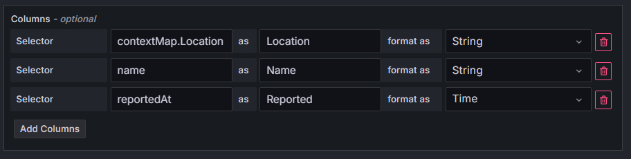
För att inkludera kontextuella parametrar, lägg till väljarkolumner som
contextMap.dittFältnamn:
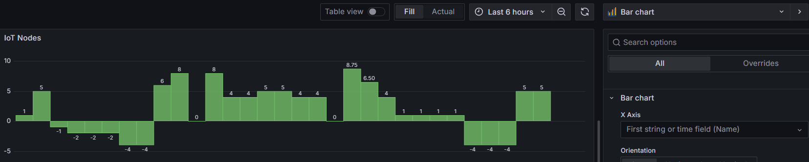
För att visa samma data som ett stapeldiagram, byt bara paneltypen till Bar chart:
Tidsserie
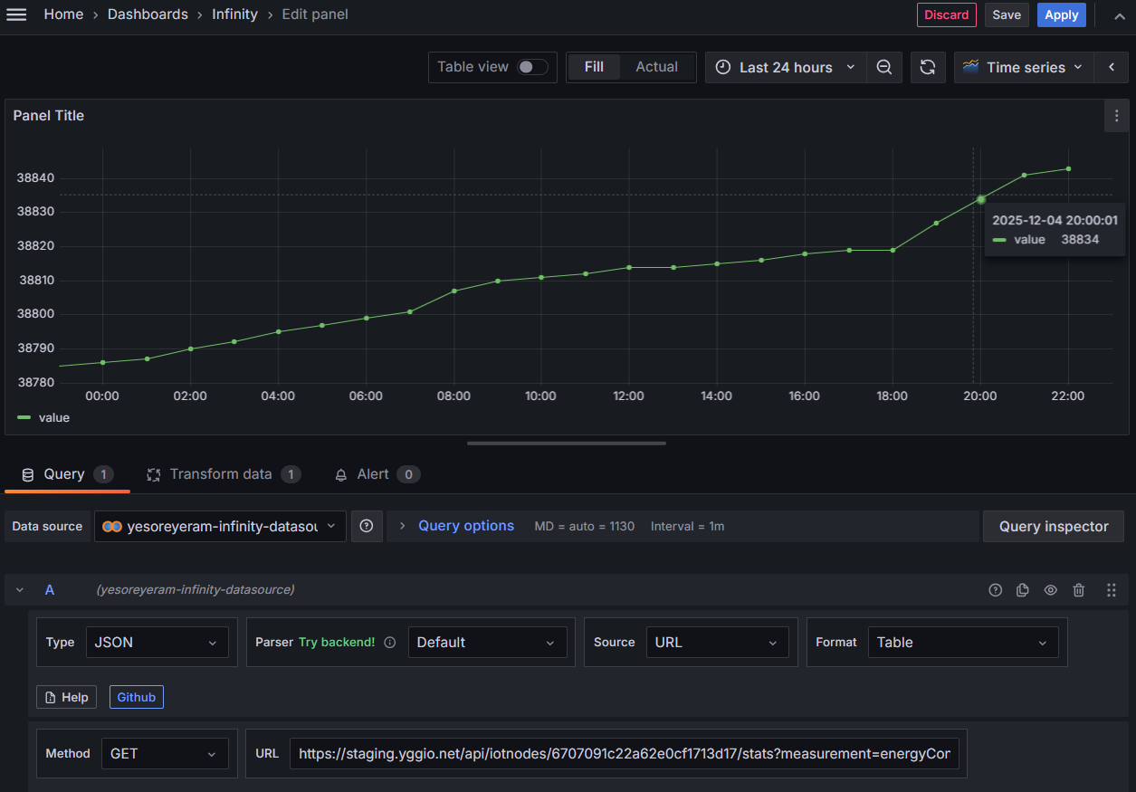
- Välj Time series som visualisering (uppe till höger).
- Ange
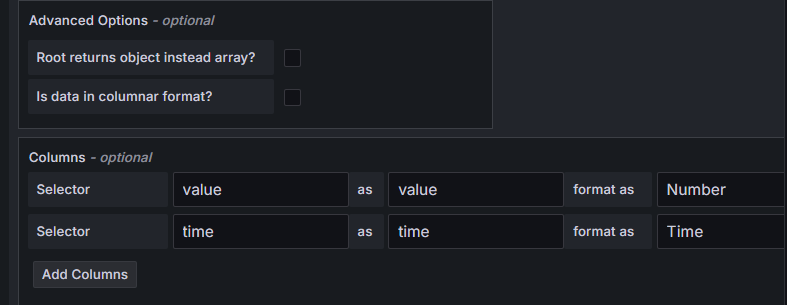
GET-URL:enhttps://staging.yggio.net/api/iotnodes/<device _id>/stats?measurement=temperature&start=<start time in unix ms>&distance=3600för att hämta tidsserien förtemperature(distanceär bucket-storleken i sekunder). - Under Parsing options & Result fields, mappa kolumnerna:
valuesom value, typNumbertimesom time, typTime
Karta (Geomap)
- Välj Geomap som visualisering (uppe till höger).
- Ange
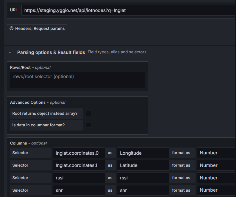
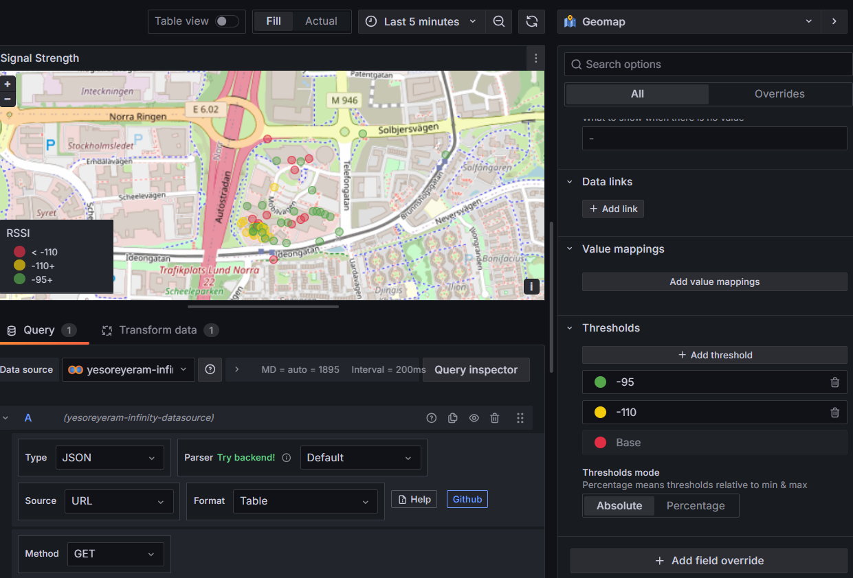
GET-URL:enhttps://staging.yggio.net/api/iotnodes?q=lnglatför att hämta enheter som har en giltig plats. - Under Parsing options & Result fields, mappa platsen och värdena att
plotta - t.ex. för en signalstyrkekarta:
lnglat.coordinates.0som Longitude, typNumberlnglat.coordinates.1som Latitude, typNumberrssisom RSSI, typNumbersnrsom SNR, typNumber
- Lägg till tröskelvärden för att färgkoda kartan.
Välja paneltyp
Grafana har många visualiseringar. För IoT-plattformens data är dessa de vanliga valen:
| För att visa… | Använd | Anteckningar |
|---|---|---|
| Ett värde som trendar över tid (temperatur, energi, luftfuktighet) | Time series | standard för mätvärden |
| Det senaste enskilda värdet, stort och fetstilt (aktuell temp, batteri %) | Stat | lägg till tröskelvärden för att färgkoda det; visar en sparkline |
| Ett värde inom ett känt intervall (batteri %, tankfyllnad, luftfuktighet) | Gauge | ställ in min/max och tröskelvärden |
| Samma värde för många enheter (batteri för varje sensor) | Bar gauge | en stapel per enhet - jokertecken-mått * + en Reduce-transform |
| En lista med enheter och deras fält | Table | Infinity → /api/iotnodes |
| Enhetspositioner, trackerspår, värmekartor | Geomap | kräver lnglat (lat/lng) |
| Ett booleskt/på-av-tillstånd över tid (närvaro, dörr, larm) | State timeline | idealiskt för presence, contact, *Alarm-fält |
| Antal eller kategorier sida vid sida (personer per zon) | Bar chart | |
| Fördelningen/spridningen av en mätning | Histogram | |
| Aktuella larm | Alert list | passar ihop med Infinity-larmregler |
Tips och tekniker
- Ställ in enheten (Panel → Standard options → Unit, t.ex. Celsius (°C), Percent (0-100), Volts) så att axlar, tooltips och Stat/Gauge visas korrekt.
- Tröskelvärden (Panel → Thresholds) färgar Stat/Gauge/Time series efter värde - t.ex. blir temperaturen röd över 30 °C, batteriet gult under 20 %.
- Värdemappningar (Panel → Value mappings) omvandlar siffror till ord - mappa
0 → Closed/1 → Open, ellerfalse → Vacant/true → Occupiedför booleska fält somcontactellerpresence. - Transformationer gör det mesta av formandet utan att ändra frågan:
- Filter by name - dölj fält som
lat/lng. - Merge - kombinera jokertecken-resultat (
*) till en serie eller tabell. - Organize fields - döp om, ändra ordning och dölj kolumner.
- Reduce - reducera en tidsserie till dess senaste/max/medel (matar en Stat- eller Bar gauge-panel).
- Add field from calculation - härledda kolumner (skillnad, förhållande, etc.).
- Filter by name - dölj fält som
- Enhetsväljare (dashboard-variabler): under Dashboard settings → Variables skapa en variabel med enhetsnamn, referera den sedan i dina frågor så att en dashboard fungerar för alla enheter. Kombinera med Repeat (Panel → Repeat options) för att automatiskt generera en panel per vald enhet.
- Navigering mellan dashboards: länka samman dashboards för att bygga en
landningssida → drill-down-upplevelse. Alternativ, enklast först:
- Text panel - vanliga Markdown-länkar till andra dashboards.
- Dashboard list panel - listar automatiskt dashboards efter tagg eller mapp, ingen konfiguration.
- Data links / panel links - klicka på en serie eller panel för att hoppa till en annan dashboard, och för med sig de aktuella variablerna (t.ex. den valda enheten).
- Business Text panel (Volkov Labs, community-plugin
marcusolsson-dynamictext-panel) - det kraftfulla alternativet: rendera anpassad Markdown/HTML från din frågedata, så du kan bygga en datadriven navigations- meny (t.ex. en länk per enhet, genererad från en enhetslista, som varje skickar den enheten till målets dashboard-variabler). Installera den först:grafana-cli plugins install marcusolsson-dynamictext-panel, och starta om.
- Automatisk uppdatering och tidsintervall: ställ in dashboardens uppdateringsintervall (t.ex. var 1 min) och ett vettigt standardintervall (uppe till höger) - Last 24 hours är en bra start.
- Legend-värden: visa senaste/medel/max i legenden (Panel → Legend) för snabba överblicksvärden.
- Larm (endast Infinity): du kan larma på vilket REST-värde som helst - tröskelvärden, eller offline-enheter via No data - se Konfigurera ett enkelt larm.
- Publika dashboards (bädda in på en webbplats, ingen inloggning): en publik dashboard kör frågor utan en inloggad användare, så den kan inte fråga IoT-plattformen direkt - datan måste först kopieras till din egen datalagring. Se Publicera på en offentlig dashboard.
Vanliga recept
Fullständiga exempel som kombinerar stegen ovan - kopiera inställningarna.
Aktuell temperatur, färgkodad (Stat)
- Ny panel → Stat. JSON-datakälla → välj enheten → fältet
temperature. - Standard options → Unit = Celsius (°C).
- Thresholds: bas grön, lägg till röd vid
30, blå vid0. → Ett stort aktuellt temperaturvärde som blir rött när det är varmt.
Batterinivå för varje sensor (Bar gauge)
- Ny panel → Bar gauge. JSON-datakälla → mått
*→ fältetbatteryLevel. - Transform → Reduce = Last (ett värde per enhet).
- Unit = Percent (0-100); Thresholds: röd
<20, gul<50, annars grön. → En stapel per sensor - visar direkt vilka batterier som är låga.
Närvaro över tid (State timeline)
- Ny panel → State timeline. Välj enheten → fältet
presence(elleroccupied). - Value mappings:
true → Occupied,false → Vacant(ge varje en färg). → Ett färgat band som visar när utrymmet var upptaget.
Larm när en enhet går offline - sätt upp en Infinity-larmregel (se Konfigurera ett enkelt larm) och använd dess alternativ No data → Alerting, så att du får en notis när en sensor slutar rapportera.
Flottöversiktstabell (Table via Infinity)
- Ny panel → Table. Infinity-datakälla →
GET https://staging.yggio.net/api/iotnodes(lägg till?q=batteryLevelför att begränsa till dina sensorer). - Parsing options & Result fields - lägg till kolumnerna:
namesom Device, typStringbatteryLevelsom Battery %, typNumberrssisom RSSI, typNumbersnrsom SNR, typNumberreportedAtsom Last reported, typTime
- Färga batterikolumnen: lägg till en field override på Battery % →
Cell display mode = Colored background, med Thresholds röd
<20, gul<50, annars grön. - Synliggör tysta enheter: sortera tabellen efter Last reported (klicka på kolumn- rubriken, eller ställ in den som standardsortering) så att de minst nyligen sedda enheterna hamnar överst. → En rad per enhet som visar batteri, signal och senast sedd - en översiktlig flotta-hälsovy.
Energiförbrukning per dag (Bar chart)
- Köra översättaren
calculate-energy-consumption-per-time-periodpå mätaren- den omvandlar den kumulativa
activeEnergyImport-avläsningen tillenergyConsumptionDay/Week/Month(var återställs vid lokal midnatt). Se Utveckla översättare.
- den omvandlar den kumulativa
- Ny panel → Bar chart (eller Time series). JSON-datakälla → välj mätaren →
fältet
energyConsumptionDay. - Unit = kWh (kilowattimme); lägg valfritt till tröskelvärden för att flagga högförbrukningsdagar. → Varje dags förbrukning; värdet strax före midnatt är den dagens totalsumma.
Ingen översättare på mätaren? Fråga den råa kumulativa avläsningen per dag via
Infinity - /stats?measurement=activeEnergyImport&distance=86400 - och ta sedan
skillnaden dag för dag i Grafana. IoT-plattformens /stats grupperar efter distance men
räknar inte ut skillnaden server-side, så översättar-metoden ovan är enklare.
Konfigurera ett enkelt larm (Infinity)
Grafana kan larma på vilken av IoT-plattformens REST-data som helst genom Infinity-datakällan. Här är ett minimalt tröskellarm - "meddela mig när en temperatur går över 30 °C" - med hjälp av Grafanas enhetliga larmhantering (Grafana 9+).
- Skapa en kontaktpunkt (en gång): Alerting → Contact points → Add contact point. Välj en typ (e-post, Slack, webhook, …), fyll i detaljerna och testa den.
- Ny larmregel: Alerting → Alert rules → New alert rule, och ge den ett namn.
- Fråga värdet (fråga
A): välj Infinity-datakällan och ange enGET-URL som returnerar talet att övervaka, t.ex.https://staging.yggio.net/api/iotnodes/<device _id>/stats?measurement=temperature&start=<ms>&distance=3600(parsavaluesom ettNumber). Kör den för att bekräfta att den returnerar data. - Reducera till ett värde (uttryck
B): lägg till ett Reduce-uttryck, funktion Last, indataA. Larmregler utvärderar ett enskilt tal, inte en hel serie. - Ställ in tröskelvärdet (uttryck
C): lägg till ett Threshold-uttryck påB, t.ex. IS ABOVE30, och angeCsom larmvillkoret. - Utvärdering: placera regeln i en utvärderingsgrupp med ett intervall (t.ex. var 1 min) och en väntetid (t.ex. 5 min) så att en kort spik inte utlöser larmet direkt.
- Notifieringar: lägg till en summary-annotation (meddelandet du kommer att få), se sedan till att regelns etiketter matchar en notifieringspolicy som dirigerar till din kontaktpunkt (standardpolicyn dirigerar allt till standardkontaktpunkten, vilket är den enklaste starten).
- Spara. När temperaturen håller sig över 30 °C under väntetiden får du en notis; den återgår automatiskt när värdet sjunker igen.
Larm för offline-enheter: i regelns Configure no data and error handling, ställ in tillståndet till Alerting när frågan returnerar No data. Kombinerat med en fråga som bara returnerar ny data notifierar detta dig när en enhet slutar rapportera.
Publicera på en offentlig dashboard
Du kan lägga en dashboard på en publik URL och bädda in den på en webbplats så att vem som helst kan se den utan att logga in - för live luftkvalitet, vattennivåer, parkerings- beläggning och liknande.
Det viktigaste att förstå först
En offentlig dashboard kör sina frågor server-side, utan en inloggad användare. IoT- plattformen returnerar av design aldrig data utan behörighet, så en offentlig (användarlös) dashboard kan inte fråga IoT-plattformen direkt - JSON- och Infinity-datakällorna ovan förutsätter att du är inloggad, vilket en offentlig besökare inte är.
Så datan måste redan finnas i en datalagring Grafana kan läsa utan en inloggning till IoT-plattformen. Mönstret: kopiera live-datan från IoT-plattformen till din egen InfluxDB, och peka den offentliga dashboarden mot InfluxDB. Ett litet Node-RED-flöde gör kopieringen - och eftersom det autentiserar mot IoT-plattformens MQTT-broker med en uppsättning grundläggande autentiseringsuppgifter (en varaktig användarnamn/lösenord, inte en användarsession), körs det obevakat. Den offentliga besökaren rör aldrig plattformen.
Yggio MQTT output ──(Basic Credential Set)──▶ Node-RED ──▶ InfluxDB ──▶ public dashboard ──▶ iframe
     durable auth              bridge flow                 no Yggio auth in the public path
Många team kör redan Node-RED, så detta återanvänder ofta infrastruktur du redan har.
Förutsättningar
- En Node-RED-installation som kan nå IoT-plattformens MQTT-broker (Node-RED-guiden).
- En InfluxDB-instans (en enda Docker-container fungerar fint - Steg 1).
- En självhostad Grafana nåbar från internet (reverse proxy + HTTPS).
- I IoT-plattformen: en uppsättning grundläggande autentiseringsuppgifter och en MQTT-kanal på varje enhet du vill publicera (MQTT-referensen).
Steg 1 - Sätt upp InfluxDB
Om du inte redan har en:
docker run -d --name influxdb -p 8086:8086 \
  -v influxdb-data:/var/lib/influxdb2 \
  influxdb:2
Öppna http://<host>:8086, kör installationsguiden och notera fyra saker du kommer att
återanvända: URL:en, organisationen, en API-token och ett bucket-namn (t.ex.
yggio-public). Använd en separat bucket per kund så att varje offentlig dashboard bara
någonsin exponerar sina egna enheter.
Steg 2 - Bygg Node-RED-bryggan
-
Installera InfluxDB-noderna: Manage palette → Install →
node-red-contrib-influxdb. -
MQTT in-nod - lägg till en MQTT-server för IoT-plattformens broker:
- Server
mqtt.staging.yggio.net, Port8883, TLS aktiverat. - Security: användarnamnet/lösenordet för uppsättningen grundläggande autentiseringsuppgifter.
- Topic: ämnet från enhetens MQTT-kanal i IoT-plattformen (enhet → fliken Channels → basicCredentialSet-kanal → kopiera ämnet). Se MQTT-referensen.
- Sätt Output till "a parsed JSON object" så att
msg.payloadär ett objekt.
- Server
-
Function-nod - omvandla avläsningen till en InfluxDB-punkt, och behåll bara de enheter du tänker publicera:
// Only these devices are allowed onto the public dashboard.const PUBLIC = ['device-id-1', 'device-id-2'];const deviceId = msg.topic.split('/').pop(); // or read from msg.payloadif (!PUBLIC.includes(deviceId)) { return null; } // drop everything else// Keep numeric canonical fields only (temperature, batteryLevel, ...).const fields = {};for (const [k, v] of Object.entries(msg.payload)) {if (typeof v === 'number') { fields[k] = v; }}if (Object.keys(fields).length === 0) { return null; }msg.payload = [fields, {deviceId}]; // node-red-contrib-influxdb: [fields, tags]return msg; -
InfluxDB out-nod - välj din InfluxDB-server (URL, token, organisation), ställ in bucketen och ett mätningsnamn (t.ex.
reading). -
Deploy. Avläsningar flödar nu in i InfluxDB.
Tappa inte data om InfluxDB hackar. Bryggan är den enda platsen Node-RED inte buffrar åt dig. För motståndskraft, gruppera skrivningar och lägg till ett litet återförsök (en
catch-nod som matar en återförsökssökväg). För några få enheter med låg rapporteringsfrekvens spelar detta sällan någon roll - dimensionera efter din flotta.
Steg 3 - Lägg till InfluxDB som en Grafana-datakälla
Ren UI, inget plugin att installera (InfluxDB är inbyggt i Grafana): gå till
Connections → Data sources → Add data source → InfluxDB, ställ sedan in frågespråket
(Flux för InfluxDB 2), URL:en http://<influx-host>:8086, och autentiseringen
(token, organisation, standardbucket). Klicka på Save & test.
Steg 4 - Bygg dashboarden
Lägg till paneler som frågar InfluxDB. En minimal Flux-fråga för ett fält:
from(bucket: "yggio-public")
  |> range(start: v.timeRangeStart, stop: v.timeRangeStop)
  |> filter(fn: (r) => r._measurement == "reading" and r._field == "temperature")
Ställ in dashboardens automatiska uppdatering (t.ex. 10 s) för en levande känsla.
Steg 5 - Gör dashboarden offentlig
På självhostad (community) Grafana, lägg till i grafana.ini:
[security]
allow_embedding = true

# Only on older Grafana (9.x / 10.0–10.1); ~10.2+ has it on by default.
[feature_toggles]
publicDashboards = true
Starta om Grafana, och på dashboarden välj Share → Public dashboard → enable och kopiera den publika URL:en. (I Grafana 11/12 finns detta under Share → External / Shared dashboard - samma funktion, med nytt namn.)
Steg 6 - Bädda in den på webbplatsen
Släpp den publika URL:en i en <iframe> i webbplatsens CMS:
<iframe src="https://GRAFANA_HOST/public-dashboards/<token>"
        width="100%" height="600" frameborder="0"></iframe>
Säkerhet, isolering och begränsningar
- Exponering: en offentlig dashboard visar allt i sin bucket till alla med
länken - det finns ingen filtrering per besökare. Håll varje kunds data i sin
egen bucket, och låt bara bryggan skriva de enheter som finns i
PUBLIC- tillåtelselistan. - Autentiseringsuppgifter: bryggans uppsättning grundläggande autentiseringsuppgifter är en verklig autentiseringsuppgift för IoT-plattformen - skydda Node-RED-instansen (håll den bakom en brandvägg; den har bara en enkel inloggning).
- Funktionsbegränsningar: offentliga dashboards stödjer inte mallvariabler, vissa paneltyper är inte tillgängliga, och resultat cachas - fint för fasta "aktuella avläsningar + senaste trend"-vyer, mindre lämpat för interaktiv utforskning.
- Latens: "realtid" styrs av uppdateringsintervallet plus den cachen, inte sub-sekund-strömning; själva InfluxDB-inmatningen är snabb.
- Historik: InfluxDB håller bara data från när bryggan startar. För att fylla i historik,
gör en engångsladdning från IoT-plattformens
/stats-ändpunkt (se Åtkomst till IoT-plattformens API).