Lektion 3.1 Grafana
Grafana är ett populärt open source-verktyg för dashboards, kartor och larm. Med IoT-plattformens två Grafana-datakällor kan du visualisera dina enheters live- och historiska data, bygga flottöversikter och få aviseringar när något går fel. I denna lektion bygger du dina första Grafana-paneler mot IoT-plattformens data.
För fullständig referens (alla alternativ), se Grafana-användarguiden.
Innan du börjar
- Grafana måste redan vara installerat och anslutet till IoT-plattformen. Om det inte är det, gör engångskonfigurationen först: Grafana-installation.
- Du behöver några aktiva enheter i ditt konto på IoT-plattformen (från
tidigare lektioner) - helst något som rapporterar
temperature, samt en tracker medlnglatför kartövningen.
Övning 1 - Din första tidsseriegraf
- I Grafana, gå till Dashboards → New → New dashboard och klicka sedan på Add visualization.
- Välj datakällan JSON när du uppmanas.
- Överst till höger, sätt visualiseringstypen till Time series.
- I frågeredigeraren, öppna Metric-listan och välj en av dina enheter
(varje enhet är en metric). Att välja
*ritar alla dina aktiva enheter samtidigt. - Sätt dashboardens tidsintervall (överst till höger) till t.ex. Last 24 hours och klicka på Refresh.
- Klicka på Apply (överst till höger) för att lägga till panelen i dashboarden.
→ Enhetens värden ritas upp över tid.
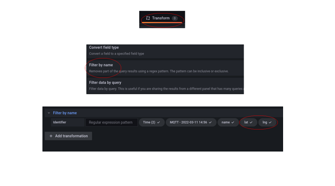
Om
lat/lngstör grafen, öppna Transform data → + Add transformation → Filter fields by name och avmarkeralatochlng.
Övning 2 - Placera dina enheter på en karta
- I dashboarden, klicka på Add → Visualization och välj datakällan JSON igen.
- Sätt visualiseringstypen till Geomap.
- Välj din tracker (eller någon annan enhet med position) som Metric, och
se till att
latochlngär inkluderade. - För en trackers rutt, välj metricen
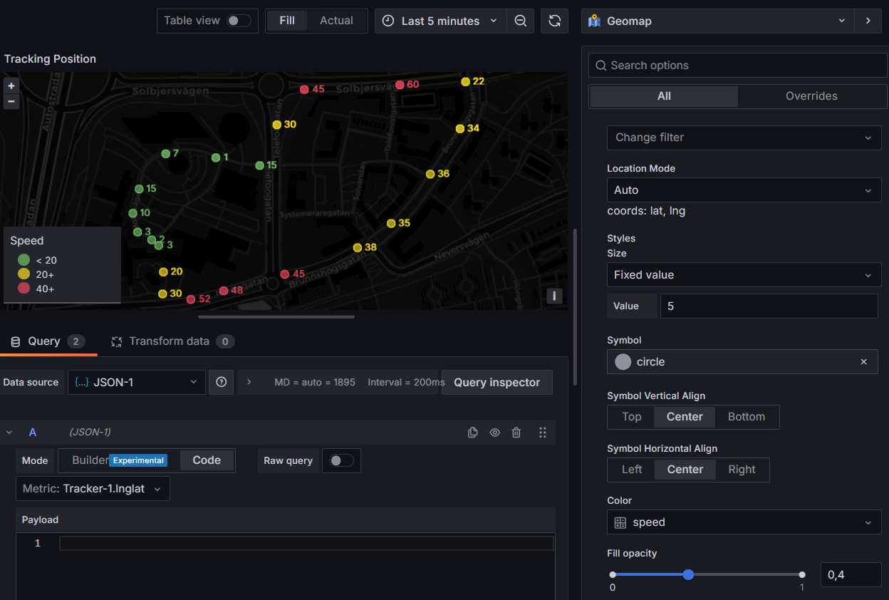
<Din Tracker>.lnglat- spåret ritas automatiskt. För att färga det, lägg till en andra fråga<Din Tracker>.speedoch färga efter det värdet med tröskelvärden under Map layers → Markers. - Klicka på Apply.
→ Dina enheter visas som punkter; en tracker visar sin väg.
Övning 3 - En flottöversiktstabell
Denna använder Infinity-datakällan, som kan anropa vilken av IoT-plattformens REST-endpoints som helst.
- Add → Visualization; välj denna gång datakällan Infinity.
- Sätt visualiseringstypen till Table.
- I frågan, sätt
Type=JSON,Source=URL,Method=GET, ochURL=https://staging.yggio.net/api/iotnodes(lägg till?q=batteryLevelför att bara lista dina sensorer). - Öppna Parsing options & Result fields → Columns och lägg till en rad
för varje (Selector → as → Format):
name→ Device → StringbatteryLevel→ Battery % → Numberrssi→ RSSI → Numbersnr→ SNR → NumberreportedAt→ Last reported → Time
- Färga batterikolumnen: Field → Add field override → Fields with name →
Battery %, sätt Cell display mode = Colored background, och lägg
sedan under Thresholds till röd
<20, gul<50, bas grön. - Klicka på kolumnrubriken Last reported för att sortera, så att tysta enheter hamnar överst.
- Klicka på Apply.
→ En rad per enhet med batteri, signal och senast sedd.
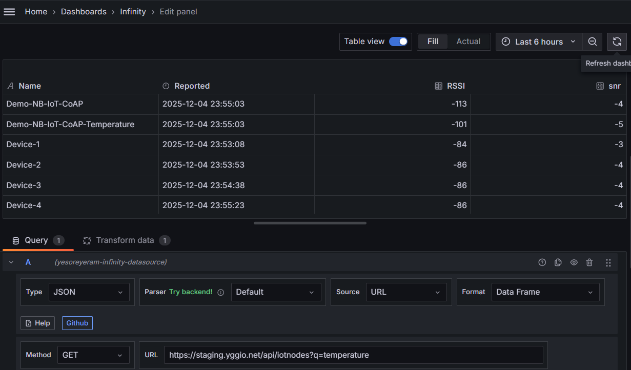
Du har nu en översiktlig hälsovy för varje enhet.
Extramål - få aviseringar
Med Infinity-datakällan kan du få Grafana att meddela dig när ett värde korsar ett tröskelvärde (t.ex. för hög temperatur) eller när en enhet slutar rapportera. Följ steg-för-steg-guiden i användarguiden: Konfigurera ett enkelt larm.
Vad du lärde dig
- IoT-plattformens två datakällor: JSON (snabba enhetsgrafer och kartor) och Infinity (valfri REST-endpoint → tabeller, grafer, kartor, aviseringar).
- Hur man bygger en tidsseriegraf, en Geomap och en flottöversiktstabell.
- Var du hittar tröskelvärden, transformationer och aviseringar.
Vart härnäst
- Grafana-användarguiden - tabell över panelval, tips och tekniker samt fler recept (energi per dag, beläggningstidslinjer, aviseringar).
- Nästa lektion: Power BI.